How I learned PowerPivot Blog Series – Creating Measures
This post is the fourth in a series about learning the built-in Business Intelligence features baked into Excel 2013. If this is your first time accessing this blog series, I encourage you to read the previous posts in order to get the proper context:
Blog One: How I learned PowerPivot from taking football stats Blog Two: How I learned PowerPivot Blog Series – Data Prep Blog Three: How I learned PowerPivot Blog Series – Behold, the Data Model!As a quick review: the first post in the series described how I used an iPad and Excel 2013 to capture stats for my son’s youth football team. The second post focused on taking raw data and prepping it to work in PowerPivot, while the third post detailed how I created relationships in the data within PowerPivot. In today’s blog, I’ll use this data model as the source for creating measures and displaying information in a Pivot Table (or two – we’ll see how far we get in this post).
A bit of review may be helpful before I proceed. Here’s is what’s been done to this point:
- Five tabs in an Excel spreadsheet, each with data related to stats captured during a game, the team roster, the teams played, penalties, and the plays themselves.
- The data ranges in each tab were converted to Tables named Play_Data, Roster, Team, Penalties and Plays
- The tables were added to the PowerPivot data model
- Relationships were created between the tables in the data model
Show me some analytics!
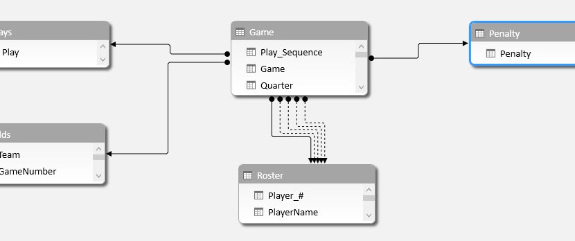
As you may recall from the previous blog post, the following fairly simple data model was created in PowerPivot:

With this model in place, I’m able to create some Pivot Tables and get into some analysis. Here’s a simple dashboard showing offensive running yards by opponent and quarter and features a Pivot Table, Pivot Chart and two Slicers. Easy for me to do, but not as easy to explain how I did it. Fortunately, Chandoo has a Make Dynamic Dashboards using Pivot Tables & Slicers video and download that will do the job nicely. Suffice it to say it took me ❤ minutes to put it together and offered the football coach the ability to do some ad-hoc analysis…

…which was fine until the coach asked me for similar analysis regarding scoring. Problem is, I only tracked the result of the play (touchdown, extra point, fumble, penalty, etc) but not the numerical score itself. Calculated Columns to the rescue!
Calculated Column – Points Scored
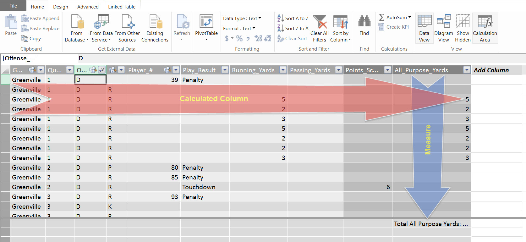
The solution to this was simple – in the Game table within PowerPivot I added a Calculated Column. To do this, I clicked in the top cell in the Add Column, typed in the super groovy formula as displayed in the image below*, and pressed Enter:

And due the magic within PowerPivot, the formula is automatically applied to every row in the table. I double-clicked the column header and typed in Points_Scored, and I was done.

* Check below for an update to the formula used to calculate Points_Scored
I then clicked on the PivotTable icon in the ribbon (see above) to create a new PivotTable. The Points_Scored calculated column shows up in the PivotTable list…

…and I used it to create the following Scoring Dashboard:

Good stuff so far – the coach is getting good info. He then asks: “can you show me stats by player of all-purpose yards?” In other words, the coach wanted some analysis of the total of offensive rushing, receiving, kick and punt return yards by player (and by offensive I don’t mean it in a bad way, although some of the runs were pretty ‘sick’). Although all-purpose yards weren’t tracked when I took the stats, I used another calculated column to sum the total of the rushing, et al yardage.
Calculated Column – All Purpose Yards
…which is as easy as it sounds. Entering in the formula below in a new column and renaming the column All_Purpose_Yards, and voila – instant measure.

But, wait, knowing the number of all purpose yards run on a single play is kinda interesting. But what the coach really wants to know is the total number of yards by a player. Or in a game. Or when running a particular play. Now what?
You’re gonna need a Measure.
Earlier in my career, I met a man named O. Dexter Sweet Jr. (and Yes, he’s a real person. You may even know him). He said to me these words: “Measures? Measures are dirt simple.” Or something like that. Point is, Measures are not as mysterious as I once thought they were, but they are powerful. Given that I’m a visual learner, the following graphic visually describes the difference between a Calculated Column and a Measure at the most basic level:
Essentially, that’s it. Well, at least enough to get started. So, let’s start.
Measure – Total All Purpose Yards
There are two ways to create a Measure: within the PowerPivot Window and within the PowerPivot tab. We’ll start in the PowerPivot Window (gentle reminder: accessed from the Excel workbook via the “Manage” button in PowerPivot ribbon)…

…and make sure the Calculation Area is displayed by clicking on the highlighted button and click on cell underneath the [All Purpose Yards] column:

Now all that’s left to do is click the AutoSum button, and the Measure is automatically created for you!

I tend to rename these Measures to suit my preferences, so I simply clicked within the Formula Bar and rename it to [Total All Purpose Yards]:

You can do the same within the PowerPivot Tab:


While creating Measures within the PowerPivot window is convenient, especially for these “sum the column” measures, I find that use the Calculated Fields option more often as 1) I have more control over the formatting of the data, and 2) I end up creating a larger number of Measures that are more complex than the basic “sum the column” measures. One thing to pay close attention to is into which Table will the Measure be saved. Since this Measure is associated with the Game, I choose to save it into the Game table. Taking a moment to think about how the Measures will be organized will not only save time in the future, but make it much easier to create pivot tables and Power View visualizations.
Yeah, so what’s the big deal? I won’t tell you – I’ll show you:

By looking at the above chart in Power View (more on Power View in a later post), I can easily see that player #15 had 289 all purpose yards when the team ran play #5. I can also instantly know that play 20 and 2.5 were complete duds. (If you’re wondering why not mention play ‘V’ – that’s the best play in the playbook: the Victory formation. You’d expect to lose yardage).
While this statistic is helpful, it is only one stat – the coach wants ‘stats’. Plural. Meaning more than one. Like, for example, average yards per carry and average yards per game. Easy, right? You just take the total yards gained and divide that by the total number of carries, right? You’d be correct. Problem is, we don’t know the total yards for the player or game, we only know the total yards for a specific play in a specific game by a specific player. Hmmm, I wonder how we can solve this problem…?
A new Measure! Let’s start with something basic: Average Yards per Carry. Now, lest you football purists jump all over me for confusing “Average Yards per Carry” and “Average Yards per Catch”, the coach defined “Carry” as either a run or pass play. So, here’s the Measure:

Here you see an example of a CALCULATE function being used, which translates into: “count the number of times a player either ran or caught the ball when the team was on offense”. With that Measure in place, now we can easily calculate the average yards per carry:

The CALCULATE is a powerful and versatile Data Analysis Expression (DAX) function. If you are not already familiar with using DAX formulas within Power Pivot, I highly recommend Rob Collie’s book DAX Formulas for PowerPivot. Not only did I find it an invaluable resource, I actually enjoyed reading Rob’s book. Entertaining and informative.
Using a similar approach, I created a host of new Measures, such as:
- Average Yards per Game
- Touchdowns, Extra Points, 2 Point Conversions, Safeties
- Offensive Rushing Yards, Offensive Passing Yards, Kick Return Yards, Punt Return Yards
Using Power View, an Excel Add-On, and the measures created above I was able to create the following analysis of individual offensive player performance:

Now this is what the coach was looking for (adding the background image was a nice touch IMO). With this, he could easily see the players that were producing the team’s offense. But as important, and maybe even more so given that this is a Youth football team, identify those players that not as involved so he could look for ways to increase their contributions. A nifty feature of Power View is the ability to click on a particular player and have the charts automatically highlight that player’s stats across the five charts.

For example, the first shows that Player #31 led the team in many of the offensive categories while Player #85 not only caught the majority of passing yards, but also led the team in 2 point conversions. That’s cool – but what plays produced the most scores? Well, funny you ask. Below is a set of Power View-based visualizations that show just that; clicking on a player’s number provides additional insight: Player #31 scored five touchdowns when they ran a particular running play, which Player #85 scored three 2-point conversions when they ran a particular pass play:

So in conclusion…
Excel is a great tool for doing all sorts of things, and if you’re anything like me you use it all the friggin’ time. Excel with PowerPivot? Well, now we’re talking pure awesomeness. You think I’m being a touch hyperbolic? Nope, I’m not. Being able to create my own dimensional models and then immediately using them for ad-hoc analysis is taking Excel to another dimension (pun totally intended). Yeah, learning DAX might take a bit of time and effort, but making this investment pays huge dividends when you can take even a modest amount of data and transform it into useful analysis.
This blog series has focused on a season’s of stats data from a youth football team and using PowerPivot to gain insights on team and individual performance. Hmmm…does this have relevance in the business world? Indeed it does. I co-authored a White Paper called The Changing World of Business Intelligence: Leading with Microsoft Excel that talks about how Excel with Power Pivot can be a place of convergence for technical and business folks to create business-oriented analytical solutions. It’s worth a read – you may gain some useful insights.
Update
I changed the formula to add the BLANK( ) function so that zeroes wouldn’t display in the Points_Scored calculated column. Why, you ask? The problem was that player number BLANK showed up in the Player # slicer in the Scoring Dashboard scoring zero points. Revising the formula as follows removes the zeroes in the calculated column, which fixes the data anomaly nicely:
=(if([Play_Result]=”Touchdown”,1,BLANK())*6)+…


